USA TRAVEL GUIDE
Hollywood Sign Photography: A Los Angeles Hillside Composition
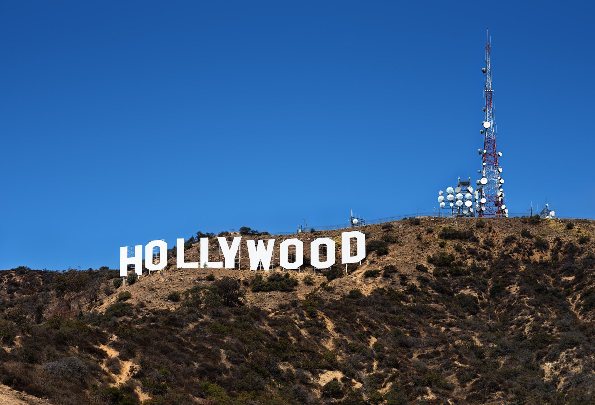
The Hollywood Sign is the clear subject of this Los Angeles photograph from 11 September 2015. The white letters run across a dry hillside, with vegetation and communications structures providing context. This is not a panorama of downtown Los Angeles, and it does not show the walking route to the sign. Its value is a close visual study of the letters in their actual hillside setting.
Read the letters against the slope
The sign is horizontal, but the terrain below and behind it is irregular. That contrast gives the photograph its character. Notice the space above the letters and the amount of hillside retained below them. Cropping too tightly can make the sign feel disconnected from its location, while too much empty sky can reduce the impact of the lettering.
Compare a frame showing the whole word with a smaller study of a few letters and surrounding vegetation. Keep the intended message clear: one image identifies the landmark, while another can explore shape and texture. The source photograph does not establish the exact standing position, so this page does not direct readers to a particular residential street or unofficial path.
Compare a landmark photograph with a hillside photograph
The white letters immediately identify the Hollywood Sign, while the dry slope and vegetation explain where it stands. Those two subjects can be balanced in several ways. A wider frame can make the sign part of the Los Angeles hills; a closer-looking frame can emphasise the lettering’s rhythm. Decide which relationship matters before trying to make the letters as large as possible. An image with more landscape can still be unmistakably about the landmark.
The communications structures visible near the sign are also part of this reference’s setting. You can include them as context or choose a composition that reduces their prominence, but do not describe a different crop as proof of a different place. Check the edges around the first and last letters and leave enough room for the word to read comfortably. A crop that clips one end can make an otherwise clear landmark photograph feel unfinished.
On a smaller display, the contrast between white letters and hillside may communicate more clearly than fine surface detail. Review the image at normal size before concentrating on sharpness alone. If haze reduces distant detail, a simple arrangement of lettering and slope may still work. The useful question is what the viewer can understand from the finished frame, not whether the sign occupied the greatest possible proportion of the original photograph.
Choose an authorised viewpoint before a hike
The Hollywood Sign’s official visitor information explains that the sign stands on Mount Lee within Griffith Park and that the sign itself occupies a restricted area. Seeing it from a viewpoint and reaching an authorised trail location behind or above it are different goals. Neither requires approaching or touching the letters.
Use the official hiking guidance to compare authorised routes, then check current park conditions before setting out. Do not rely on a photograph to judge gradient, surface, shade or route length. An apparently close view can have been made with a different composition or lens from a location that is not obvious in the picture.
Match the light to the white letters
Bright white surfaces can lose texture when the surrounding hillside is much darker. Review whether the letters still have definition rather than assuming that a bright overall image is the best result. If the light is harsh, a composition including more hillside can help the viewer understand the setting even when fine details in the letters are less prominent.
Haze and visibility also affect how large the sign needs to appear in the frame. A distant view can place it within Los Angeles’s wider landscape; a closer-looking frame makes the letters the main subject. Do not label one as better simply because the sign fills more of the picture. Choose the distance and route that fit your visit and make the composition work from there.
Keep the outing realistic for the conditions
The hillside in the reference looks dry. That is visual context from September 2015, not a current trail or fire-condition assessment. Check the day’s official information, carry what your chosen route needs and avoid treating a short-looking line on a map as an easy photographic detour. The way back matters as much as the outward walk.
Follow posted access restrictions, remain on authorised trails and respect nearby residential streets. Do not climb fencing, enter a restricted area or block a driveway to reproduce a camera angle. If a route or viewpoint is closed, choose another authorised perspective. The landmark can be photographed as part of the landscape without making proximity to the letters the measure of success.
Choose the intended side of the sign before choosing a route
A photograph looking towards the front of the lettering and a permitted viewpoint above or behind the sign are different goals. From behind, the lettering cannot be expected to read like the familiar frontal view. The wider city may become more important instead. Decide whether you want a recognisable word in the landscape or the relationship between the hillside and Los Angeles before choosing an authorised route.
Use the official sign information to compare the nature of the available outings, then confirm the current park arrangements. A route that suits a longer walk may be unnecessary for someone who only wants a clear distant view. Equally, a distant photograph does not explain the experience or physical demands of a hike. Keep those decisions separate so that the picture you want does not become a reason to underestimate the day’s route.
Build in a straightforward point at which to turn back or finish photographing. If visibility is poor or an intended viewpoint is unavailable, a lawful alternative may provide a useful hillside record without reproducing this frame. Keep residential access and park boundaries in mind while moving between locations. The sign’s value as a subject comes from its identity and setting; it does not depend on reaching the letters or making a closer approach than current rules allow.
Use a small, distinct set of photographs
A useful sequence could show the sign within the hills, the full lettering more tightly, and a separate wider city view from a permitted location. Those images would have distinct purposes. Repeated crops of this single photograph would not provide that variety and should not be presented as different works across the USA guide.
Keep the original source date, photographer and licence with the reference. The page makes no claim of a personal visit or of the creator’s camera settings. Its contribution is the specific analysis of the sign’s hillside composition and the distinction between viewing, hiking and restricted access, helping readers choose a suitable way to photograph this Los Angeles landmark.
Continue planning your USA trip
Sources and further reading
FAQ
Can I walk up to or touch the letters?
The official Hollywood Sign information says the sign is in a restricted area. Use authorised viewpoints and trails, and follow current park instructions.
Is this a photograph of downtown Los Angeles?
No. The visible subject is the Hollywood Sign and its hillside setting. A downtown panorama would be a different photographic subject.
Does the reference reveal the route or camera settings?
No. It records a view of the sign in September 2015. Exact route, standing position and technical settings are not inferred from its appearance.